Comparing the true size of Australia vs Greenland

"The Mercator projection is a cylindrical map projection presented by the Flemish geographer and cartographer Gerardus Mercator in 1569. It became the standard map projection."
This is the map I'm used to but it has major distortions.
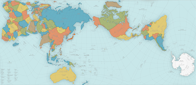
"The ‘authagraph’, a world map designed by hajime narukawa that aims to fix the problems with our current maps — distorted land and sea sizes and political and geographical misunderstandings."
I don't like this map. It doesn't seem like much of an improvement to me.

THE TRUE SIZE OF MAP
"The True Size" map lets you move countries around the globe,
to show how big they really are.
Now this is my favorite map. There seem to be fewer distortions and you can superimpose countries to see their relative sizes. Each state and country's flag is displayed as you move it. You can even rotate the countries for a better look.
Here's the link: The True Size Of ...


.jpg)


Interesting, John 🌎
ReplyDeleteIt can be difficult to comprehend the size of countries in comparison to others.
ReplyDeleteInteresting to read this John, thank you.
All the best Jan
I've always been so fascinated by maps. And globes, too.
ReplyDeleteI think most Americans don't realize that Canada is bigger
ReplyDeleteAll the maps are interesting. The second one gave me a feeling of vertigo. Mmmmph.
ReplyDeleteThanks for the link - didn't realize there was such a site.
ReplyDelete